Walk into any paint store this December, and you’ll be greeted by displays showcasing the 2026 color of the year. Mocha Mousse. Apricot Crush. Whatever poetic name the brand has chosen. The swatches look gorgeous under those bright showroom lights. But here’s what the marketing teams won’t tell you: that same shade could make your bedroom feel like a cave by February.
The “color of the year” announcement has become a ritual. Pantone kicks it off, followed by Benjamin Moore, Sherwin-Williams, and a dozen other paint brands. These aren’t random picks. They’re carefully researched predictions tied to fashion runways, global mood shifts, and yes, sales targets. A warm terracotta might signal our collective craving for comfort after years of uncertainty. A bold blue could reflect optimism about the future. The psychology is real, but the execution in your home? That’s where things go sideways.
The three lighting traps that ruin trendy colors
The first trap is showroom deception. Paint stores use high-CRI (Color Rendering Index) lighting specifically designed to make colors look vibrant and true. Your living room has a mix of natural light from windows, overhead LEDs, and maybe a table lamp with a yellowish bulb. That sophisticated sage green that looked earthy in the store can turn muddy gray under your ceiling fixture. The color hasn’t changed; your lighting has exposed what it really is.
The second trap is directional light. Indian homes, especially those built in the last two decades, often have large windows facing east or west to maximize ventilation. Morning light has a cool, bluish cast. Evening light is warm and orange. A single wall can look like two different colors depending on the time of day. Trendy colors with complex undertones like mauve, taupe, or greige are especially vulnerable. What reads as a soft blush at 9 AM can turn lavender by 6 PM.
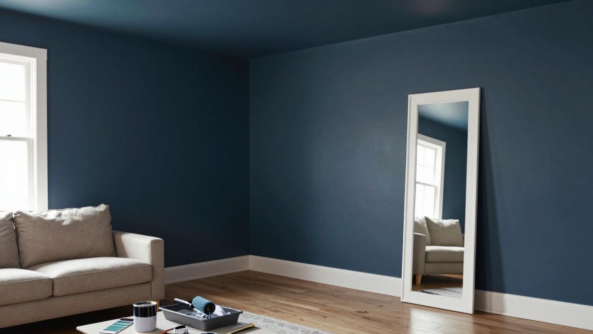
The third trap is room size and natural light volume. Dark, saturated colors absorb light. If your room is small or has only one window, painting it in this year’s deep chocolate or forest green will make it feel even smaller. The walls visually advance toward you. Lighter colors reflect light and make walls recede. This isn’t opinion; it’s how human spatial perception works. A 10×10 bedroom painted in a trendy dark hue can feel like a 9×9 room.

The five-minute swatch test that saves you thousands
Before you commit to a full wall, buy a large paper swatch or a sample pot. Most paint brands in India now sell 200ml tester pots for under ₹300. Paint a 2×2 foot square on the wall you’re considering. Not on a poster board, not held up against the wall. Actually paint it on the surface.
Now observe it at three specific times: mid-morning (10 AM), late afternoon (4 PM), and after dark with your usual indoor lighting. The color will shift. Take photos with your phone at each time. Your camera doesn’t lie the way your excited brain does. If the color looks dull, too dark, or just “off” in any of those three lighting conditions, you’ve just saved yourself the cost of 20 liters of paint and a weekend of regret.
Here’s the detail most people miss: look at the color while standing in the doorway, not right next to it. You don’t experience your room from six inches away. You experience it from across the space. A color that seems fine up close can overwhelm the entire room when you step back.
Safe zones to try the trend without the risk
Your front door is the single best place to experiment. It’s a small surface area, it’s outside (so lighting is consistent), and a bold color actually increases curb appeal. A front door in the 2026 color of the year makes a statement without affecting how you live inside your home. Repainting a door takes two hours and less than a liter of paint.
Throw pillows and cushion covers are the second safest bet. You can buy or sew covers in the trendy shade, scatter them across your sofa, and swap them out in three months when the color feels tired. Cost: ₹2,000 to ₹5,000. Commitment: zero.
An accent wall is the middle ground. Choose the wall that gets the least direct sunlight, usually the one opposite your main window. Paint only that wall. If it works, great. If it doesn’t, you’ve only got one wall to repaint, not four. Avoid accent walls behind your bed; you want that space to feel restful, not stimulating.
Art and decor are the no-regret option. A large canvas print, a woven wall hanging, or even a bold rug in the trending color gives you the aesthetic without the permanence. You’re not altering the architecture of your space. You’re accessorizing it.

Quick fixes when you hate the color you just painted
Let’s say you ignored all this advice and painted your living room in a color that now makes you anxious. You have options that don’t require repainting the entire room.
First, change your lighting. Swap out cool white LED bulbs (5000K-6500K) for warm white ones (2700K-3000K). Warmer light softens harsh colors and adds a golden cast that makes most shades feel cozier. This fix costs under ₹1,000 and takes ten minutes.
Second, add white or cream elements to break up the color. A large white bookshelf, cream curtains, or a light-colored sofa will visually dilute the wall color. Your eye will focus on the contrast, not the overwhelming single shade. This is why hotel rooms use neutral furniture even when walls are bold.
Third, use the 60-30-10 rule retroactively. If your walls are the problem, make them the 60% (dominant color), then introduce a 30% secondary color through furniture, and a 10% accent color in decor. This creates balance. A room that’s 100% one trendy color feels like a paint ad, not a home.
If none of that works, paint over it. Use a high-quality primer (don’t skip this), and go with a soft white or warm beige. You’ll need two coats. It’s a weekend project, not a tragedy. The lesson costs more than the paint.
Why your home isn’t a showroom
Paint companies employ color psychologists, trend forecasters, and designers. Their color of the year is chosen to sell paint, inspire renovations, and generate media coverage. It’s not chosen specifically for your north-facing flat in Pune or your small rental in Bangalore. Your home has unique light, unique proportions, and unique needs. A color that works beautifully in a spacious Scandinavian loft with floor-to-ceiling windows might be completely wrong for a typical Indian apartment with moderate natural light.
The smartest approach is to treat the color of the year as a starting point, not a mandate. If the shade genuinely excites you and you’ve tested it properly in your space, go for it. But if you’re painting something just because the internet says it’s the color of 2026, pause. Your walls will outlast the trend. Make sure you’ll still like looking at them in March, not just in the store in December.
Test the color in your actual light, start small, and give yourself permission to walk away if it doesn’t feel right. Your home should make you feel calm and happy, not like you’re living inside someone else’s mood board.